Serebro Nabora Type Conference

About

Serebro Nabora is an annual international type conference held in Moscow. Today’s graphic designers are clamoring for typographic knowledge. Serebro Nabora came to address this problem. The first annual Serebro Nabora conference was attended by participants from every part of Russia and the neighbouring countries. It proved a resounding success and became one of the most significant events for the local design community. The need for a setting for typographic learning combined with social interaction among graphic design professionals was so palpable that the idea immediately took hold. The venue quickly became the social centre for the graphic design professionals of Russia and other countries of the former USSR. Type designers, graphic designers, calligraphers, and anyone interested in typography found an avenue of professional exchange and a memorable occasion to get together at the conference. In 2013, the Conference became international in scope, with speakers and audience hailing from around the world.

Movie by Shan Design

Organisers:

Brownfox_black

B&D_black

Program

30 September

  • Rainer Erich Scheichelbauer

    Glyphs Introductory Workshop

    We will start by sketching a letter and digitising it. Then, we will add some letters, export a font, and test it in InDesign. In the afternoon, we will add more letters to the font, space them, optimise them for the screen, but also add diacritics, and produce combined letters. At the end of the day, you will have a pretty good start for your first font.
    Requirements:
    No prior experience required, some experience with Bézier-based vector drawing tools useful.
    Bring your MacBook (OS X 10.9.5 or later).
    Download and install the Glyphs trial from www.glyphsapp.com/buy.

  • Joey Hannaford, Jeff Pulaski

    Letterpress Light, workshop

    In today’s world of digital fonts, digital layouts and e-publishing, designers are increasingly removed from physically handling the objects they design. While this is becoming more and more true of books, ads, brochures and other printed ephemera, it has long been the case with typographic design. We think this is part of the reason for the current popularity of letterpress in design circles. Letterpress printing deals with physical typographic objects and allows designers to touch and feel the objects they work with on a daily basis.
    This workshop is for participants to get a brief feel for letterpress printing. In the workshop, participants can handle letterforms and work together to create typographic compositions. We will use a limited set of wood type, cut paper and acrylic letterforms in latin and cyrilic scripts. In this guided workshop, participants will “print” with raised letterforms to create typographic experiments using stamping and rubbing techniques that mimic normal letterpress. This workshop will be completely experimental, allowing designers to push the boundaries of typographic form in new ways and in the process discover more expressive solutions to typographic problems.

1 October

  • Registration

  • Gayaneh Bagdasaryan, Vasily Tsygankov

    Introduction
  • Patrick Goossens

    Long Live the Letterpress: Belgian Story

    A talk about the long survival of the common press, the introduction of the iron hand press, the cylinder press in the nineteenth century with a focus on Belgium. About the very early copying of other peoples designs and mechanism by our local industry.

  • Ilya Ruderman, Yury Ostromentsky (CSTM Fonts)

    Type Today

    Which type to use? How does the type have to look in 2016? How important is the modernity criteria for contemporary typography and type design? What makes contemporary typeface look modern? And how will this modernity look tomorrow?

  • Konstantin Kunarev, Alexander Lubovenko (ParaType)

    Font Mastering

    When talking on type, we usually mean the designer’s part of work, mostly the letterforms. But the font is not just the letters and digits and spaces between them. What happens after the glyphs are done and the spaces are set, especially if we mean rather a large foundry than an individual designer? The modest heroes of the type world are going to tell about the functioning of the technical department in a type foundry, the interaction between type designers and type technologists, the stages between the design of the first style and the release of the type family, tuning Robofont and making the most of Fontlab… and the importance of being a coder.

  • Lunch-break

  • Laura Meseguer

    When Fascination Becomes Profession

    Laura Meseguer's talk will present her practice as a journey from the start, when she discover the discipline, till today, based on her reflexions and perspectives on a career full of discoveries and experiences. She will also take the opportunity to talk about the Typographic Matchmaking in the Maghreb project, where the confluence of three writing systems: Latin, Arabic and Tifinagh, and the collaborative work with other type designers, gave her an opportunity to explore and develop some creative inventions for the design of the Latin Script.

  • Ben Wittner, Sascha Thoma (Eps51)

    Multi-script Typography

    Due to globalisation and cross-cul­tural interactions, multilingualism plays an eminent role all around the world. More and more designers and artists find themselves working for clients of diverse nations and cultural backgrounds.
    Ben Wittner and Sascha Thoma will talk about the growing relevance of multilingual graphic and type design describing the challenges of combining different scripts with varying visual precepts and habits.

  • Brody Neuenschwander

    Textasy, the Work of Brody Neuenschwander

    Brody Neuenschwander will show and discuss his artistic and calligraphic work. From his early work with film director Peter Greenaway to his more recent work in a wide variety of materials and contexts, Neuenschwander will show how he has attempted to bring calligraphy into the modern world. In metal, plaster, on canvas and paper, in film and video installations, his calligraphy takes many forms and explores issues of legibility, history, social and political contracts and the materiality of writing.

2 October

  • Vasiliy Rozhdestvin

    Judicial protection of copyright on typefaces in Russian Federation

    Judicial practice of the copyright protection on typefaces with examples of cases. Methods of confirmation of rights to the font and methods of proving an infringement. The mechanism of bringing perpetrators to justice. The consequences of a copyright infringement of the font and the possible amount of compensation.

  • Gerd Fleischmann

    Type and Typography at the Bauhaus – Weimar, Dessau, Berlin

    Lettering and art prints in Weimar, invention of Neue Typographie 1923, the concept of reduction, commercial art as part of the Bauhaus business. An excursus is dedicated to the analysis of the B-A-U-H-A-U-S signage in Dessau.

  • Florian Schick, Lauri Toikka

    Typonoom

    Working as an independent type foundry on custom and retail typeface projects.

  • Lunch-break

  • Dimitri Bruni, Manuel Krebs (NORM)

    Case Studies

    The lecture is a survey on Norm’s Typefaces created between 2006 and 2016. It focuses on the corporate-typefaces Omega CT and the multilingual Swatch CT, as well as on the self-initiated typefaces Replica and the upcoming Riforma.
    The lecture depicts the background, clarifies the principles and shows the process.

  • Hakobo

    HGW Hakobo Graphic World

    Journey through the most important Hakobo typographic projects and visual inspirations

  • Yomar Augusto

    Nomad-Type-Processing

    Exploring my nomadic life style in relationship with my own work, life and experiments.

3 October

  • Rainer Erich Scheichelbauer

    Glyphs Pro Workshop

    We will start with a monoline (open paths) design in Glyphs, and generate an OpenType font from it. By adding glyph variations, we will make Glyphs auto-generate OpenType features for us. We will expand the mono line to a single-axis Multiple Master set-up, making use of built-in features as well as third-party scripts and plugins.
    Requirements:
    Prior experience in type design required (the words OpenType and Multiple Master should not sound foreign to you) or the introductory workshop.
    Bring your MacBook (OS X 10.9.5 or later).
    Download and install the Glyphs trial from www.glyphsapp.com/buy.
    Make sure you know your Admin password, because we will make some installations.

3-7 October

  • Brody Neuenschwander

    The Calligraphic Line

    In this workshop we will explore the calligraphic possibilities of the line, the expressive mark and the self-constructed letter. We will take the alphabet apart and put it back together again in new combinations. We will be inspired by Chinese, Arabic and unusual Latin scripts to create living, moving scripts that break out of the typographic box that most designers and artists live in. This will be a free and creative look at the Latin and Cyrillic alphabets.

Speakers

  • Yomar Augusto

    Yomar Augusto is a typographic artist and graphic designer based in Souther California since the beginning of 2016. Before moving permanently to the West coast of United States, he was based in New York City for 3 years and in The Netherlands for 9 years. Raised in Rio de Janeiro, Yomar initially trained as a graphic designer before going on to study photography at the School of Visual Arts. He started his own studio in Rio before completing a Masters in Type Design at the Royal Academy of Art in The Hague. Yomar also taught Typography for Advertising at the Willem de Kooning Academy in Rotterdam between 2011 and 2012, at the Bauhaus University in Germany, and at the Fashion Institute of Technology and The School of Visual Arts in NYC. He has also held a number of experimental calligraphy and book art workshops in many countries. Currently he is setting a new studio merging his Art work & commercial endeavours.

  • Dimitri Bruni, Manuel Krebs (NORM)

    Dimitri Bruni (*1970) and Manuel Krebs (*1970) studied graphic design at the School of Applied Arts in Biel-Bienne. Established together the graphic design studio NORM in 1999. In 2005 Ludovic Varone (*1977) joined the studio. Norm focuses on designing and publishing books and typefaces. Book design includes self-commissioned research in the field of type and graphic design, the most relevant being ‘Norm: Introduction’ (2000) and ‘Norm: The Things’ (2002). Commissions include numerous collaborations with museums (TATE Modern; Kunsthaus Zurich; Museum for Design Zurich) and artists (Fischli & Weiss; Simon Starling; Christian Marclay). Examples for type design include the ‘Simple’ typeface for Cologne airport (2003), the corporate typeface for OMEGA watches, the typeface ‘Replica’ (2008) and the corporate typeface for Swatch (2010). In 2005, Norm won first prize in the Swiss National Bank’s competition for the new banknote series. In 2011, Norm was awarded the Grand Prix Design by the Swiss Government.

  • Gerd Fleischmann

    Gerd Fleischmann, born 1939 in Nuremberg, Germany, studied at the Hochschule der bildenden Künste (today: Berlin University of Art) and at the Freie Universität Berlin. Later on he did design work for cultural institutions in Berlin aside of teaching mathematics and arts and crafts at the Menzel High School. He started his career as a typography teacher in 1971 at the Bielefeld University of Applied Sciences, and run the first digital design competitionin Europe, the PAGE Wettbewerb in 1989.
    Gerd was fascinated by the Bauhaus since he bought the catalogue of the first great Bauhaus exhibition in Germany after the war, Stuttgart 1955. One of his seminal books is ‘bauhaus. typografie, drucksachen, reklame’ (bauhaus. typography, printed matter, commercial art) for Edition Marzona in 1984 which will be published in Russian, updated and enriched, in 2017. He designed a pile of art and design books, way finding systems in public buildings, and some important and prize winning exhibitions about Nazi time. He was teaching abroad at the NCAD in Dublin, Ireland, the NSCAD in Halifax, Nova Scotia, Canada, the Vietnam University of Fine Arts in Hanoi, and the Universidad de Costa Rica, to mention only a few. In the very moment he is working on an internationally travelling exhibition, entitled Industry and the Holocaust.

  • Patrick Goossens

    Patrick Goossens is a historian specialising in the history of printing techniques located in Antwerp, Belgium. He is a founding member of the Friends of the Plantin-Moretus Museum, and a volunteer in several printing museums throughout Belgium and abroad. After getting his history degree at Antwerp and Louvain University, he started to collect books, and whilst doing so, found an advert declaring ‘why buy more books, print them yourself’, which led to the purchase of a simple press. At the time, in the late seventies, the intention was to publish archival resources. This however did not remain the case and the urge to collect printing equipment took on a life of its own, leading to a large collection of nineteenth century printing machines (hand and cylinder presses), type foundry equipment and associated paraphernalia. Using this collection as industrial archaeological evidence, Goossens returned to archival sources to try to reconstruct the history of printing’s technological evolution. In this vein he has, along with Bob Oldham, undertaken a new study of George Clymer’s Columbian hand press, outlining the technological developments that lead to its invention two hundred years ago. The two have also collated a census of still-existing Columbians. The result of all the research will eventually be the groundwork for a PhD on the subject.
    Goossens’ collection is far from being an inert and static accumulation – it is a living archive, and even the machinery that is currently in disrepair, is just waiting for a new lease of life. Furthermore, Goossens’ collection is a laboratory, and to date Goossens has made hands-on forays into casting historical typefaces, engraving new matrices and has made a full-scale reproduction of a sixteenth century common press. Goossens is also concerned with the relationship of craftsmen with their tools, and latterly with machinery. This interest stems from the fact that he is the current incumbent in charge of the artisanal bakery that has been in the family since 1884, and which is the source of income for his archive.

  • Hakobo

    Jakub Stępień aka Hakobo (born 1976) is currently listed among the world’s top fifty most important poster artists (according to John Foster, author of New Masters of Poster Design: Poster Design for the Next Century). He feels at home in visual identity, activities bordering art and design and the generally understood utilitarian graphics. He collaborates with many cultural institutions, e.g. The Art Museum in Łódź, CSW Zamek Ujazdowski Warsaw, Design Gallery BWA Wrocław, Tate Britain in London. His clients include Pogo Skateboarding, The Łódź Design Festival, Wyborowa, TVP and others. He has a characteristic style, inspired by traditional graphic crafts as well as street culture. His collection of works consists of both disciplined, simple arrangements and those inspired by his fascination with camouflage, graphic noiz and the excessive.

  • Joey Hannaford

    Joey Hannaford holds a BFA in Graphic Design and an MFA in Printmaking from the University of Georgia where she concentrated on letterpress printing, handlettering, calligraphy and book arts. Clients include Cartoon Network, Coca-Cola, Delta Airlines, Disney, Emory University, and Georgia Tech. Commissions include original works of art for four Presidential Libraries and an American Institute of Architects commission for HRH The Prince of Wales. Awards include CASE Special Merit Awards of Excellence, UCDA Awards of Excellence, and inclusion in numerous publications such as Type Rules!, Typeface and HOW Magazine. Joey has recently has taught letterpress workshops at University of Nicosia in Cyprus and at Typography ’14 in Pune, India. Recent exhibitions include Anglia Ruskin University, Cambridge University, Cambridge, UK, University of Notre Dame, Indiana, and The National Print Museum, Dublin, Ireland. She is currently an Associate Professor of Art in Graphic Design at the University of West Georgia in Carrollton. Joey’s students have won design awards such as Graphis International New Talent, Adobe Student Design Achievement Awards, and HOW Magazine Self-Promotion.

  • Konstantin Kunarev

    Konstantin Kunarev is a programmer, a musician, a bike traveler and almost a restaurant critic. He is working in Paratype’s technical department since the company was founded. During that time, Konstantin developed a huge lot of font production utilities and acquired a great experience in solving type technical problems even before they may occur.

  • Alexander Lubovenko

    Alexander Lubovenko is a type designer, a graphic designer and a type programmer at the same time. He began programming when he was 16 using the imaginary computer from “Science and Life” soviet magazine instead of a real one. In 2014, Alexander graduated from “Type and Typography” course of BHSAD. He is currently working for Paratype as a type designer and constantly uses Python for enhancing all foundry’s projects.

  • Laura Meseguer

    Laura Meseguer is a freelance designer, typographer and type designer based in Barcelona, where she was born in 1968.
    Her activity is developed in the field of commercial work and personal projects. She specializes in any kind of project based on typography, from lettering for monograms and logotypes to custom typefaces and book design.
    In 2003–2004, she took a year off from her regular work to study type design at the post-graduate course ‘Type]Media’ at the Royal Academy of Arts in The Hague, Netherlands. Rumba, the typeface she designed as part of this course, was selected in the TDC TypeDesign Competition 2005 and got the the AtypI Prize Letter.2 2011. In 2014 she got the TDC TypeDesign Competition 2014 for her typeface Lalola and the ISTD Certificate of Excellence for the “BCNMCR Letters” project. She also holds awards from the ADG-FAD (The Art Directors & Graphic Designers Association, Spain).
    In addition to her practice, Laura teaches Type design at the Master’s in Advanced Typography at “Eina. Escola d’Art i Disseny” and Typography at Elisava, both in Barcelona. She also gives lectures and workshops all around.
    Laura’s work has been featured in several publications and exhibitions, more recently in ‘Graphic DesignNow in Production’ at the Walker Art Center along 2011-2014. She is the author of the book ‘TypoMag. Typography in Magazines, edited by IndexBook and, together with Cristóbal Henestrosa and José Scaglione, co-author of the book “mo crear tipografías. Del boceto a la pantalla”, published by Tipo e.
    Through her own digital foundry, Type-Ø-Tones, she releases and promotes her typefaces. At the moment she is part of the Typographic Matchmaking in the Maghrib 3.0 project, consisting in the 3rd edition of the multi-script typographic research project of the Khatt Foundation (13 September 2015 — 30 November 2017).

  • Brody Neuenschwander

    Brody Neuenschwander is a text artist and calligrapher. He studied at Princeton University and the Courtauld Institute, where he completed his PhD in 1986. At the same time he studied calligraphy at the Roehampton Institute.
    From the start, Neuenschwander asked serious questions about the place of calligraphy in the modern world. What is it? How is it used? Where should it be headed?
    In 1989 Neuenschwander began a twenty year collaboration with director Peter Greenaway, providing live-action calligraphy for the films Prospero’s Books and The Pillow Book, as well as for the operas Writing to Vermeer and Columbus and many other projects.
    Though the mark of the pen is usually present in Neuenschwander’s work, so are typographic letters, scratched letters, drawings and paintings. The question is posed again and again, “Is this an image or is this a text”.
    In 2004 Neuenschwander taught at the Museum of Fine Arts in Boston, researching the development of text art in the 20th. Recently projects have included video installations, stained glass, monumental texts in metal and stage performances with live calligraphy.
    Neuenschwander’s work attempts to bridge the gap between conceptual art and the acts of drawing, painting, writing. Neither the medium nor the message is the message. Both are involved in the dialectic between the artist and his experience of the world.

  • Jeff Pulaski

    A life-long Kansan, Jeff Pulaski was born and raised in Newton, Kansas in the United States. He earned a Bachelor of Fine Arts degree from Wichita State University in 1990 and a Master of Fine Arts in Visual Communication from Kansas State University in 2008. He is currently an Assistant Professor of Graphic Design at Wichita State University. He is an active letterpress printer and collector. His letterpress collection has grown to weigh in at nearly 10 tons. It includes various platen and cylinder presses, a Prouty Power Press newspaper press, an 18” Challenge paper cutter, a Model 31 Linotype, two Ludlows and large assortment of metal and wooden type.

  • Vasiliy Rozhdestvin

    A lawyer with over twenty years of legal practice. He specializes in intellectual property protection. One of the first lawyers who held a court case about copyright on the font.

  • Ilya Ruderman, Yury Ostromentsky (CSTM Fonts)

    They are both graphic and type designers. Founders of CSTM Fonts (2014) type foundry and a new font distributor type.today (2016).
    Graduated from Moscow State University of Print (Graphic Design Department), where they took Alexander Tarbeev’s classes.
    Ilya Ruderman graduated from Type & Media (Royal Academy of Art), the Hague, the Netherlands. After graduation he was a tutor of Type&Typography course at British Higher School of Art and Design, Moscow (2008-2015), was an art-director of information agency RIA Novosti. He is an author of cyrillic versions of such typeface as Lava, Graphik, Neutraface and others, that was made for such studios as Typotheque, Commercial Type, Typonine and House Industries. He is an author of: Permian typeface, Big City Grotesque and several other corporate typefaces.
    Before 2013 Yury Ostromentsky worked mostly as an editorial designer and art-director of BigCity Magazine, where he used his personal lettering, that was the base of the Pilar typeface, released by CSTM Fonts last year. He is an author of several book series designs and logotypes.
    Both typefaces of Ilya Ruderman and Yury Ostromentsky were the winners of such type design competitions as Modern Cyrillic 2009, Modern Cyrillic 2014, Granshan 2011, European Design Award 2012. Kazimir typeface and Tele2 Typefamily, the CSTM Fonts’s latest releases, were among the winners of Granshan 2015.

  • Rainer Erich Scheichelbauer

    Rainer Erich (‘Eric’) Scheichelbauer was born in Vienna. A trained photographer, Eric holds both a philosophy and a Dutch studies degree. He creates typefaces, works as a digital punchcutter for other type designers, and gives type design workshops on a regular basis. Since he has joined the Glyphs team in 2012, he has been writing articles, tutorials, and Python scripts, as well as the blog and the handbook. He lives and works in Vienna, where he runs his type studio Schriftlabor.

  • Florian Schick, Lauri Toikka (Schick-Toiika)

    Florian Schick studied graphic design at the Royal Academy of Art The Hague, The Netherlands, from which he graduated with distinction (2010). He successfully completed his Master Degree at postgraduate course Type and Media (2011).
    Lauri Toikka holds BA degree in graphic design from Lahti Institute of Design, Finland (2010) and MA degree in type design from Type and Media masters program at the Royal Academy of Arts in The Hague, The Netherlands (2011).

  • Ben Wittner, Sascha Thoma (Eps51)

    Ben Wittner and Sascha Thoma both studied visual communications in Pforzheim, Germany. After a few long-term living and working trips to Cairo, Brussels, Paris, Brighton and London they founded Eps51 in Berlin in 2008. The internatio­nally active graphic design studio develo­ps visual concepts with a strong focus on typography and bilingual design.
    As a result of their extensive research on Arabic and Iranian type and graphic design Wittner and Thoma edited the book series Arabesque—Graphic Design from the Arab World and Persia, Die Gestalten Verlag (2008 and 2011). In 2012 they organized the project Right-To-Left comprising an exhibition of contemporary graphic design from the Arab world and Iran featuring more than 160 posters, as well as lectures, discussions and workshops. Eps51 are currently working on a new book project on multi-script design.
    Ben Wittner and Sascha Thoma regularly take part in exhibitions, give lectures and hold workshops.

Sponsors

Heavy Sponsors

Bold Sponsors

Book Sponsors

Print sponsors

Sponsorship Levels

Ultra Sponsor $3000+
Your company logo is displayed on the Serebro Nabora 2015 homepage with a hyperlink to your website.
You may sponsor the evening party.
Your representative may make a five-minute presentation during the conference.
Your logo will be projected on the screen before and between the presentations. The length and frequency of the logo’s “air time” will depend on the contribution.
Your company logo is printed  in the Serebro Nabora 2015 Program Guide.
Your promotional materials are distributed at the conference.
You will receive a special mention at the closing ceremony.

Heavy Sponsor $2000+
Your company logo is displayed on the Serebro Nabora 2015 homepage with a hyperlink to your website.
Your logo will be projected on the screen before and between the presentations. The length and frequency of the logo’s “air time” will depend on the contribution.
Your company logo is printed  in the Serebro Nabora 2015 Program Guide.
Your promotional materials are distributed at the conference.
You will receive a special mention at the closing ceremony.

Bold Sponsor $1000+
Your company logo is displayed on the Serebro Nabora 2015 homepage with a hyperlink to your website.
Your logo will be projected on the screen before and between the presentations. The length and frequency of the logo’s “air time” will depend on the contribution.
Your company logo is printed  in the Serebro Nabora 2015 Program Guide.
Your promotional materials are distributed at the conference.
You will receive a special mention at the closing ceremony.

Book Sponsor $500+
Your company logo is displayed as a Book sponsor on the Serebro Nabora 2015 homepage and dynamically linked.
Your logo will be projected on the screen before and between the presentations. The length and frequency of the logo’s “air time” will depend on the contribution.
Your company logo is printed in the Serebro Nabora 2015 Program Guide.
You will receive a special mention at the closing ceremony.

We are always open to developing new ways for conference sponsors to communicate their messages. If you would like to become a sponsor or discuss sponsorship please contact us: info@serebronabora.com

Contact

info@serebronabora.com
projects@obe.ru (tech support)

+49 151 578 44 508 Gayaneh Bagdasaryan
+7 903 623 17 25 Ekaterina Filyaeva

Sign up for our newsletter:
Thanks – you’ve successfully subscribed.

Facebook   Twitter   Flickr

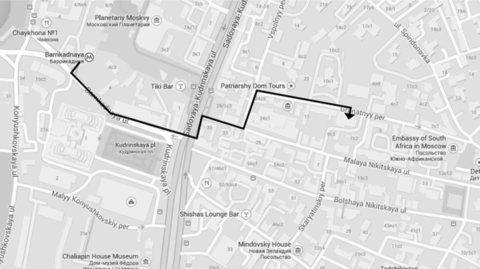
Map

Conference 1-2 October
Central House of Architects
Moscow, Granatny pereulok, 7 bld. 1

map_cda_eng-690

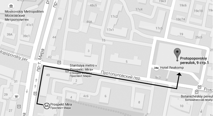
Workshops
Institut of Business and Design
Moscow, Protopopovsky pereulok, 9 bld. 1

map_obe_eng-690

Registration

Tickets costs:

Conference 1-2 October (Included: access to the conference room, conference bag, simultaneous translation)

Until July 15th:
for professionals 1500 ₽ (about 20 €) | for students* 1000 ₽ (about 13 €)

From July 16th till August 31st:
for professionals 2000 ₽ (about 26 €) | for students* 1300 ₽ (about 17 €)

From September 1st:
for professionals 3000 ₽ (about 40 €) | for students* 2000 ₽ (about 26 €)

Joey Hannaford, Jeff Pulaski
Letterpress Light, workshop (30 September) | 1500 ₽ (about 20 €)

Rainer Erich Scheichelbauer
Glyphs Introductory Workshop (30 September) | 3000 ₽ (about 40 €)

Rainer Erich Scheichelbauer
Glyphs Pro Workshop (3 October) | 3000 ₽ (about 40 €)

Brody Neuenschwander
The calligraphic line, workshop (3-7 October) | 27000 ₽ (about 357 €)

* The Student rate is only available to students enrolled in a full-time program.

Register now


Archive

Publications