Program

17 November

12:00

Alexey Dombrovsky

Dombrovsky
designer,
book design historian


Vladimir Krichevsky


designer, design historian, author

Tagir Safayev


type designer, lecturer
at Higher Academic School of Graphic Design

Boris Trofimov


book designer, HASGD professor

Emil Yakupov


director of  ParaType
type foundry

In memory of Vladimir Yefimov (round table)

Vladimir Efimov, a typeface designer, died suddenly on February 23, 2012. He was a friend and a mentor to generations of type designers. His fonts are admired by the design community worldwide and have won numerous awards in international competitions. The participants of the round table will share their memories of this special man and his work. The discussion is open.

12:40

Yuri Gordon


type designer, Letterhead

A Book of Letters from Aa to Zz: Second Edition, corrupted and corrected

The book of letters was the first study to analyze construction of the characters of modern Russian alphabet. When it was first published in 2005,
the Russian typography was beginning to come back
to life after the late Soviet hibernation. In the seven years following its publication a small typographic revolution has taken place in Russia. The number
of type designers and therefore the number
of Cyrillic typefaces available on the market has increased manifold. If custom fonts were a rare occurrence when the book was first published, today it’s unusual for a new periodical to launch without
a commissioned typeface. The new letterforms and the new ideas that have proliferated called for this new edition. A portion of the book discusses Proteus, a new type design tool, conceived by the author. The software, currently in development, may dramatically affect the process of type design in the future. One consequence of the new software
is already evident. It has affected the way the author looks at type: a sizable portion of the new edition
of The Book of Letters deals with so-called “shape clouds,” overlapping letterforms, as they appear
in Proteus software.

As a revised edition of Russian design bestseller that has quickly become a rarity, we hope this book will
be well received.

13:00

Gayaneh Bagdasaryan


type designer
Brownfox

Brownfox type studio and its typefaces

New typefaces: text and display, serif and sans serif, restrained and emotional, austere and eccentric — all projects by the new Brownfox studio aspire to create a vivid, modern and unique typographic impression.

13:20

Dmitri Makonnen


publisher, designer, typographer

Poster Typography

A combined palette of typography and lettering allows a piece of visual persuasion to convey a more powerful emotional statement. Occasionally a hand-lettered object makes a stronger impact than a typographically composed headline. As in concrete poetry championed by the Futurists, lettering is an excellent tool to immediately convey emotions and intonations of the author’s voice.

13:40

Peter Bankov


graphic designer,
founder of [kAk) magazine and Design Depot studio

Contact Space

We shall discuss visual communication on multiple surfaces, as well as two-dimensional graphics that transcend their spatial confines.

14:00

lunch break

15:30

Emil Yakupov


director of  ParaType
type foundry

Font Licensing

Font design will be examined as an object of intellectual property.
 Font piracy, protection, as well as legal rights of type designers, type foundries, and end users will be discussed. We shall cover the meaning behind font licenses, as well as their types. We shall also discuss some prominent  lawsuits dealing with font design in the US, Europe, and Russia.

15:50

Katerina Kozhukhova


editorial designer,
lecturer at British Higher School of Art and Design

Editorial Typography

We will analyse current typographic trends in Russian magazines: which typefaces are most commonly used and why. We shall examine whether trendy fonts affect sales and we shall investigate who is really responsible for the magazine house font selection.

16:10

Alexander Vasin


graphic designer, illustrator,
founder of Typomania festival  

Typomaniac’s Confession

We shall examine typographic awareness in Russian art schools, discuss the five ways to motivate and to demotivate a student, raise ethical issues in Russian body art, and touch upon safety precautions in using carpentry tools.

16:30

Ilya Ruderman


type designer
“Type and typography” programme tutor
“Ria Novosti” art director

Type and Typography Programme

Type and Typography curriculum at the British Higher School of Art and Design was developed for practicing communication designers who wish to advance their skills in type and typography.

17:10

Natalia Toropitsyna


illustrator, calligrapher

Olga Umpeleva


graphic and type designer, calligrapher

Anton Mizinov


designer at RIA Novosty, calligrapher

Olexiy Chekal


graphic designer, calligrapher, art director of Panic design studio

Workshops

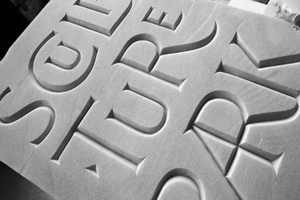
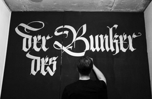
Two fragile young ladies will teach you how to chisel letters into slabs of marble, while two macho men will show you how to create elegant calligraphy with quills and supple brushes.
 Not to be missed!

18 November

12:00

Danila Vorobiev


Art director of design studio “Otdel-72″,
lecturer at British Higher School of Art and Design

Evolution of Cyrillic letterforms in 17th–19th centuries

Today’s type designers routinely adopt the familiar shapes of Cyrillic letters that predominated in the late 19th and early 20th centuries. A variety of alternate historical forms remains untapped. This presentation will investigate key milestones in evolution of the Cyrillic typographic letter over the past two centuries. We hope the increased awareness of the variety of historical character shapes will provide type designers a greater opportunity to find precise and period-appropriate design solutions. Resulting solutions could go a long way to expand stylistic range in Cyrillic typography while maintaining historical integrity.

12:20

Yury Yarmola


FontLab font editor
developer

FontLab Victoria presentation

Is there a life after FontLab Studio? A sneak peek into new type design software tools to come from the creators of the market leading FontLab.

12:40

Gennady Fridman


Technology department head, ParaType type foundry 

Web Fonts: Their Peculiarities, Application, and Future

Although the technology of Web fonts embedding has changed little since 1998, their active use became possible just a few years ago, as soon as all major browsers had agreed upon the support of specific font formats, on one hand, and these formats were found suitable for the type founders, on the other.

13:00

Olexiy Chekal


graphic designer, calligrapher, art director of Panic design studio

The Flourish: Its History, Classification, Rules, and Use

The flourish is a part of typographic tradition and an art form to itself. Originating from character extensions and calligraphic exercises, it went on to assume its own esthetic value. Typographic ornaments, monograms, initials, and logos are some of the current places one flourishes. This presentation will examine the history of the flourish, its classification and rules of construction. It will explore its appearance and distinct structural features corresponding to various hitorical styles: Renaissance, Blackletter, Baroque, Skoropis’ (Batarde), etc. It will also touch upon calligraphic elements adapted to display and text types, and look at how the archaic swash forms are absorbed into current typographic culture.

13:20

Alexandra Korolkova


type designer, art-director
of ParaType font foundry

Deduction Methods in Type Design

Everyone has heard of Sherlock Holmes’ deduction methods but can anyone explain them?
 Surprisingly, the job of a consulting detective and that of a type designer have lot in common. How can we apply deductive reasoning to type design? Which details deserve most attention? Does a type designer need the Police News of the Past newspaper? This short and subjective talk will search for some clues.

13:40

Olga Karpushina


graphic designer, type designer,
lecturer at British Higher School of Art and Design

Calligraphy and Individuality

A philosophical discussion of calligraphy as an expression of individuality. We will discuss metal composition, the influence of tools on the appearance of letterforms; the human element, thought processes, memory patterns, synesthesia, designer’s hand, the line living and lifeless, computers, and vector shapes. We will talk about the importance of human touch, embodied in a living line.

14:00

lunch break

15:30

Tagir Safayev


type designer, lecturer
at Higher Academic School of Graphic Design

Type as an Object of State Control

This presentation will focus on the unique historical path of the Cyrillic script, as distinct from its Latin counterpart. Its close connection to and its tight control by the Orthodox Church, as well as its initial ecclesiastical application will be discussed. Subsequent civil typographic reform that has wrestled typography away from the church and entrusted it to the state will be examined, with conclusions relevant to today’s Cyrillic drawn.

15:50

Katerina Kochkina


Design director, Design Depot studio,
art director, [kAk) magazine,
lecturer at British Higher School of Art and Design 

Typography, Lettering, Client

Let’s imagine that the type is a chicken and the letter is an egg. One may not be particular about the quality of the eggs, as long as they do their job in the dough. However, if one becomes more health-conscious, one begins to consider the chicken’s rating, size, lifestyle, and food. Some diets eschew eggs altogether. In other words, there are different goals and different means of meeting those goals. Real life case studies from DesignDepot studio and [kAk) magazine.

16:10

Erken Kagarov


graphic designer,
 art director, Art. Lebedev Studio 

Opticum Typeface

When I was a kid, my favorite painter was Victor Vasareli. I spent a long time studying optical illusions, and, in particular, linear textures, which led to the creation of the Opticum type that could change its readability depending on the context, point of view, and other external factors. I used this font in posters and logos, Christmas cards and book design. The typeface was released by ParaType in 2008.

16:30

Pavel Rodkin


graphic designer,
 branding expert,
 author

Typography in Today’s Corporate Identity

This presentation will discuss the typographic logo as an effective, and perhaps a more universal, alternative to the mark. We will demonstrate real life examples of this leading trend in corporate identity. Important qualities of today’s typographic identity will be covered: non-linear storytelling and priority of the visual structure over grammar and spelling. We will touch upon typographic identity in regional branding.

16:50

Evgeny Dobrovinsky


calligraphy instructor

Mummy, I Want to Write!

We shall describe calligraphy lessons from an aged postal clerk, Sgt. Protsenko, designers Gannushkin and Lazursky, two construction workers, and a sofer. We shall discuss the lettering artist’s lifelong contract, as well as the nonspecific relationship between writing, calligraphy and typography. Brought to you by the man with no handwriting.

17:10

evening party