Program

24 November

11:00

Luc(as) de Groot

Luc(as)
type designer
LucasFonts

Aleksandra Samulenkova

Samulenkova
type designer
LucasFonts

Eye Opener Type Design

Three days intensive workshop.

During the workshop Luc(as) and Aleksandra will provide their profound understanding of what type design is. Thus, participants will follow the path from a sketch to a font file, grasping logic and regularities within a typeface, learning to see and evaluate letter shapes. Look forward to three intense days saturated with lots of practical work as well as Lucas’ lectures on crucial issues of type.

This workshop is perfectly suitable for type design novices as well as for graphic designers who want to improve their skills in working with letters — and shapes in general.

25 November

11:00

Eye Opener Type Design workshop continued

26 November

11:00

Eye Opener Type Design workshop continued

27 November

11:00

Erik van Blokland

Erik
type designer
Letterror

Long distance TypeCooker

Two days workshop.
What happens if you look at your type drawings at
a distance of 10 meters? and at 20 meters? In this workshop we’ll look at the basic parameters of sketching type, and the effects of size and distance. Maybe we’ll see something new!

28 November

11:00

Long distance TypeCooker workshop continued

29 November

10:00

Registration

11:00

Gayaneh Bagdasaryan


type designer
Brownfox

Vasily Tsygankov

cigankov
head of graphic design department,
Institute of Business and Design

Introduction

11:10

Erik van Blokland

Erik
type designer
Letterror

Light and Letters (and code)

Erik will introduce some small research projects. The first: some things to keep in mind about when drawing small details: type for reading sizes is designed to be at the edge of the average eye can see. But what does that mean — and look like?
What happens when we walk away from the screen? How amateur science can help understand and see.

11:55

Just van Rossum

OLYMPUS DIGITAL CAMERA
type designer, programmer

How type & code became inseparable

A personal overview of the development of type design and type design tools in the digital age.

12:40

Luc(as) de Groot

Luc(as)
type designer
LucasFonts

Designing big type families with optical mathematics, ClearType hinting and kernologica research to improve the readability per square centimeter…

Luc(as) will consider crucial aspects of type design with an average speed of 10 slides per minute. You will get profound insights into Luc(as)’ design principles, research results, company and private life. Caution: the talk may contain hinting issues.

13:25

lunch break

14:55

Irina Smirnova

Smirnova2
type designer

Theory of Writing: between East and West

Nowadays the art and and daily practice
of handwriting is being rapidly replaced by typing. Therefore Irina would likes to look at writing from the two different points of view: Western and Eastern. What are the properties and meanings
of handwriting besides its main communicational function? Western theory of writing was developed by Gerrit Noordzij, Edward Johnston and earlier calligraphers and theorists. In the east, namely
in China, calligraphy has always been considered the highest of arts. The theory, aesthetics and practice
of Chinese calligraphy has been consistently, comprehensively and thoroughly  developed for a few thousand years. In China calligraphers strived not for a perfect form but for a perfect movement. A specific writing style was understood as an art-program which helped to achieve a certain spiritual state.
Can Chinese theory of writing contribute to the understanding and development of our own culture? Can something new emerge in between East and West?

15:40

John Hudson

Hudson
type designer
Tiro Typeworks

Same Difference, or what is the type designer doing and why?

The practice of typeface design can be understood conceptually in terms of managing relationships of sameness and difference. John Hudson presents examples of how various kinds of sameness (harmony, coordination) are applied to things that are necessarily different (letters, writing systems), and suggests possible reasons for it based on recent research in cognitive science.

16:25

David Jonathan Ross

Ross
type designer
Font Bureau

Backasswards!

Reversed-stress typefaces occupy a funny little corner of the world of typeface design. With heavy horizontal strokes and thin vertical stems, these typefaces flip letter-drawing conventions on their head, often with unusual, eye-catching, and sometimes even useful results.

These typefaces are often associated with the American West, but they have much more to offer than the novelty of gunslingers and swinging saloon doors. This talk will explore the history of the genre, take a closer look at some particularly interesting specimens, and detail the drawing challenges that arise when the thick parts get thin and the thin parts get thick.

18:00

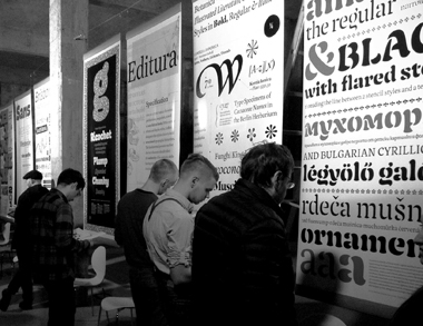
“Type Graduation Projects 2014”. Exhibition opening.

Last year we presented Type Masters exhibition showing the works of the Type and Media course graduates 2013. This year’s exhibition is going to expand. The latest type design projects from the Type and Media (KABK) and MA Typeface Design (Reading) Master programs and also graduation projects from the two Moscow-based courses — Alexander Tarbeev’s Workshop (MSUP) and Type & Typography Course (BSAD) are going to be exhibited. Over twenty new type projects containing Latin, Cyrilic and also non-latin scripts.

doreuli2

The exhibition will take place at the Promgraphica Gallery
Glinishevsky pereulok, 5/7, entrance 6

Сurator Maria Doreuli

30 November

11:00

Eugeny Grigoriev

eg
typographer

The Dash. Rules and Aesthetics

The dash. It seems that no other punctuation mark has stirred up such heated disputes among typographers and font designers in many decades. Em or en dash? Sidebearing or not? With spaces around it or without?
In what way and why have the setting rules changed in different typographic cultures, how were these processes affected by traditions and technologies and why the typographic standards won’t be preserved.

11:45

Frederik Berlaen

Frederic
type designer, programmer
Typemytype

“More Tools, Please!”

“cmd+R: Work For Me”
“Your Best Assistant”
“from idea import design”
“Time For a Coffee”
“Effects vs. Tools”
“Euh, I Don’t Understand”

12:30

Vladimir Krichevsky


designer, design historian, author

Presentation of the book “Two faces of one revolution” by its authors

This book is devoted to typography of a decade complicated and tragic, as well as bold and vivid — revolutionary twenties of the 20th century. This period will have been remembered by its unprecedented freedom and unspent hopes, amateurism full of inspiration and a creative chorus… As well as by total, fatally accelerated by the revolution, dissociation of art to old and new, traditional and path-breaking, right and left. It is hardly surprising that there were two popular typefaces at that time too: Chekhonin-style and geometrical, caps only square sans (palochny).

13:15

lunch break

14:45

Elena Novoselova

Novoselova
type designer

Alexander Tarbeev’s type design workshop

Alexander Tarbeev has been teaching at Moscow State University of Printing Arts since 2002. Final student type design projects completed every year. Three of his students continued their type design study at Royal Academy of Art at The Hague (KABK), two of them — TDC winners. The talk covers teaching methods at the workshop. Student projects will be observed.

15:30

Laurenz Brunner

Laurenz
type designer
Lineto

Skeuomorphs in Typography – Ghosts from the Past

Over the past millennium, the Western alphabet has barely evolved. The way typography is displayed on an iPad retina display still largely resembles the way text was arranged on a 2000 year-old parchment scroll. Even though mechanical typewriters were invented more then 150 years ago, we still input text on almost identical keyboards – albeit their apparent flaws and the substantial cultural and technological advancement since. Why is typography so resistant to change?
This lecture addresses anachronisms in typography, failed attempts to reform typographic conventions, and how Science Fiction can help us to understand the typographic conditions of our time.
16:15

Jean-Baptiste Levée

Jean-Baptist
type designer
Production Type

Of curvatures, straight lines and light: when is type not type?

This is the question, amongst several others, that one will try to answer by presenting a handful of recent commissions. Because typeface design does not operate ex nihilo, questions evolving around the practice, and appended goals will be analyzed. In order to document a daily practice of typeface design, an overview of references, inspiration sources and work methods will be displayed through recent projects.

17:00

The Announcement of the Winners of the International Type Design Competition “Modern Cyrillic 2014”

The first Modern Cyrillic type design competition was organized by Vladimir Yefimov and Emil Yakupov in 1999. The second competition, held in 2009 brought in 234 entries from 13 countries. This third competition, Modern Cyrillic 2014, judged by an international jury will review the best in Cyrillic type design since September 15, 2009.

ModCyr2014

17:45

evening party

01 December

11:00

Frederik Berlaen

Frederic
type designer, programmer
Typemytype

Just van Rossum

OLYMPUS DIGITAL CAMERA
type designer, programmer

DrawBot + RoboFont

Three days workshop. RoboFont is a UFO-based font editor. One of the design principles is full scripting support for both your font data as for interfering with the application. DrawBot is an powerful, free application for MacOSX that invites you to write simple Python scripts to generate two-dimensional graphics. The workshop will be collaboration between DrawBot and RoboFont by exploring with code by designing your own tools.

02 December

11:00

DrawBot + RoboFont workshop continued

03 December

00:00

DrawBot + RoboFont workshop continued